
At long last the NHL and Adidas have finally released the Stadium Series jerseys for the Philadelphia Flyers, New Jersey Devils, New York Rangers, and New York Islanders. Today we’ll be looking at the Stadium Series jerseys, and ranking the jerseys.
4. New York Islanders
Starting in last place we have the New York Islanders who also are the recipients to the “At least You Tried” Award. This has Lou Lamoriello’s fingerprints all over it as it’s very bland and boring. Just like the hockey teams he builds.
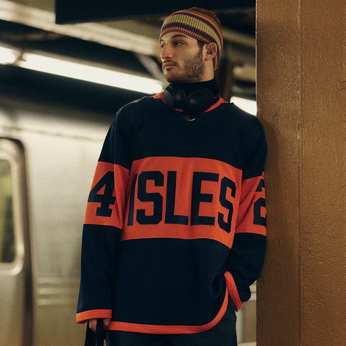
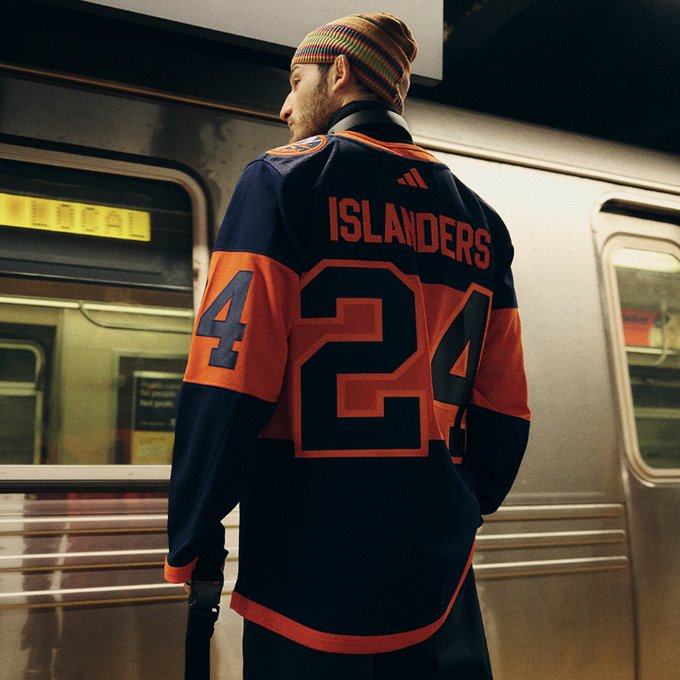
The Isles are going with a navy jersey with a massive orange stripe across the center with “ISLES” in navy in the middle of the jersey. The jersey also has a large orange stripe on the sleeves that’ll feature the jersey numbers in navy, and a small orange trim on the bottom of the jersey and sleeves and on the collar. On the back of the jerseys the players names will be in orange, and the numbers will be navy with orange trim. It should be noted that the orange trim is a brighter orange than the one being used on the jersey itself.
The Islanders logo is on the left shoulder while the Stadium series patch is on the right shoulder. Overall, this jersey is near the bottom of the barrel along with their Reverse Retro jerseys which they either didn’t try (RR1.0), or bastardized something that could have been great (RR2.0).
3. New Jersey Devils
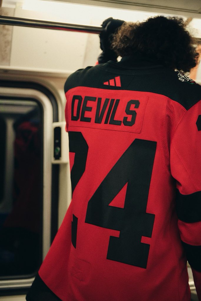
Ok, so I’m going to get some hate for this, but the New Jersey Devils come in third for me. I understand what they are going for, but I’m just not feeling it. They essentially took their current home jersey, removed all of the white, and enlarged the logo and numbers for the Stadium Series atmosphere. Also, having the names and numbers in all black is a choice to say the least. I wouldn’t be surprised if they passed the TV test, but I could see them being a little problematic to see live at MetLife Stadium. However, I could be wrong, and I’ll know soon enough when I am at the Devils/Flyers game on Feb. 17th.
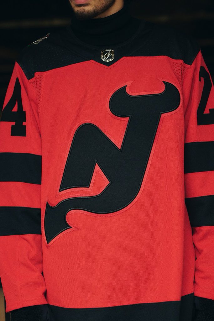
Overall, I think the colors are fine, I’d just change a few things personally to make it more aesthetically appealing. And who knows, maybe these jerseys will grow on me when I see them in action next month.
2. New York Rangers
Coming in at number two we have the New York Rangers. Honestly, I’m a little surprised myself that I have the Rangers ranked as high as I do. I really thought they would have been lower, but after looking at the jersey more this one grew on me rather quickly, like a Jacob Trouba elbow to the head.

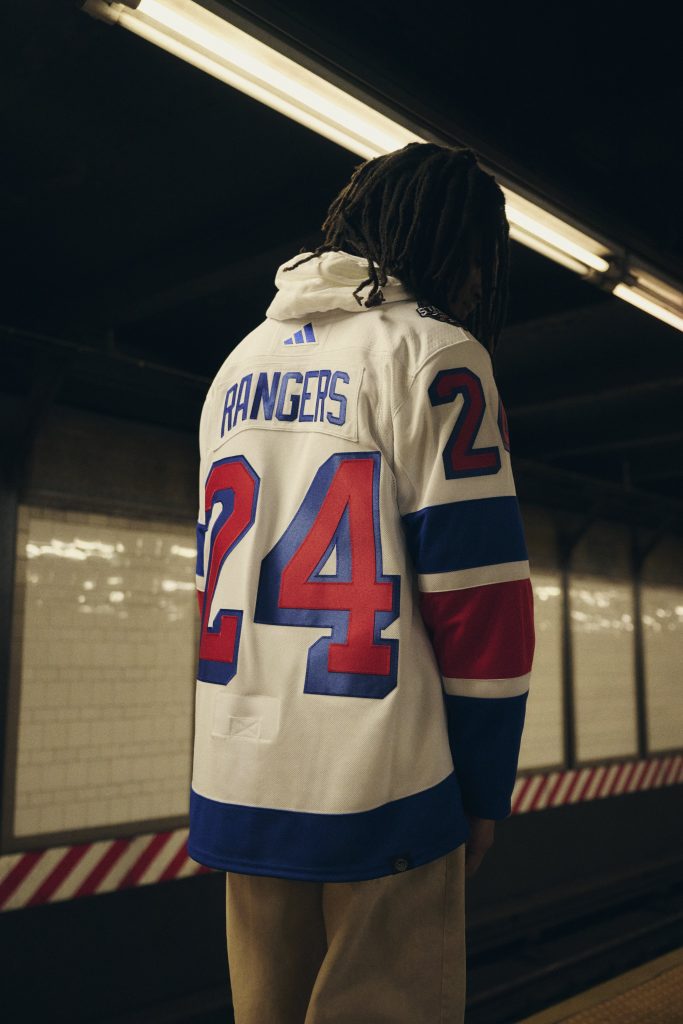
The Rangers, being the road team for the sixth time now for an outdoor game, is rocking white jerseys with red and blue large stripes on the sleeves with smaller white stripes for spacing. The bottom of the jersey has blue base. The player names are also in blue, but the thing that really stands out to me the most is the “NYR” and the numbers. The red with blue borders makes this jersey really stand out to me, and in a really positive way. The Rangers doing the “NYR” like they have their team name on their home and roads doesn’t bother me as much as it’s very on brand, but they did a really great job of making them stand out. Overall, I could see me getting this jersey for my collection (and I do need a Rangers jersey for my collection).
1. Philadelphia Flyers
Coming at the number one spot is the Philadelphia Flyers. For a team that has already gone a rebrand of the summer I was kind of worried what they would do for the Stadiums Series, but I’m actually really impressed with the Flyers did here.
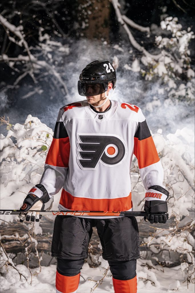
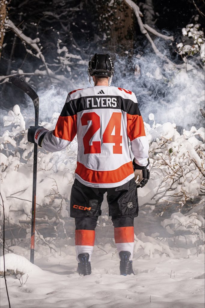
Rocking a white jersey, the Flyers jersey has an orange stripe on the bottom with white trim underneath, but what really makes this jersey stand out to me is the how the sleeves contribute to the back of the jersey. The sleeves which have a large orange stripe on the middle of the sleeve with a smaller black stripe above. The black stripe, however, stretches from sleeve to sleeve across the back, and on the black stripe on the back is where the players names go. I think that’s really cool and creative. The players numbers are in orange with no borders to them just like with their new home and road jerseys, but instead of having the numbers on the sleeves, they are on the shoulders, which is a nice touch to really differentiate themselves from the other jerseys. Overall, I love these jerseys, and I would definitely buy one for the collection.
Noteworthy Mention
While it’s not a Stadium Series jersey, on Thursday night the San Jose Sharks unveiled their new alternate jerseys.
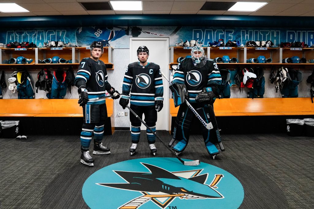
Nicknamed the “Cali Fin” or the “Evolve” jersey, the Sharks introduced their newest alternate jersey a little over a year after going through a rebrand themselves. Going back to black for their base the Sharks used their secondary “Cali Fin” logo as their primary, and on the shoulders they reintroduced the Northern California Shark-fin in a re-imagined design for which they revised from their 2015 Stadium Series jersey. It has the same setup as the current home and road jerseys, but with additional teal striping to help bring more life to the jersey, which I feel it succeeds at doing. Hands down this jersey is a thousand times better than that awful Stealth jersey they used to wear.
Leave a Reply