It has finally come! The Washington Capitals unveiled their 50th Anniversary branding on Monday morning, and there is so much to take in and breakdown in regard to what we’ll be seeing for the next year.

The 50th Anniversary Logo
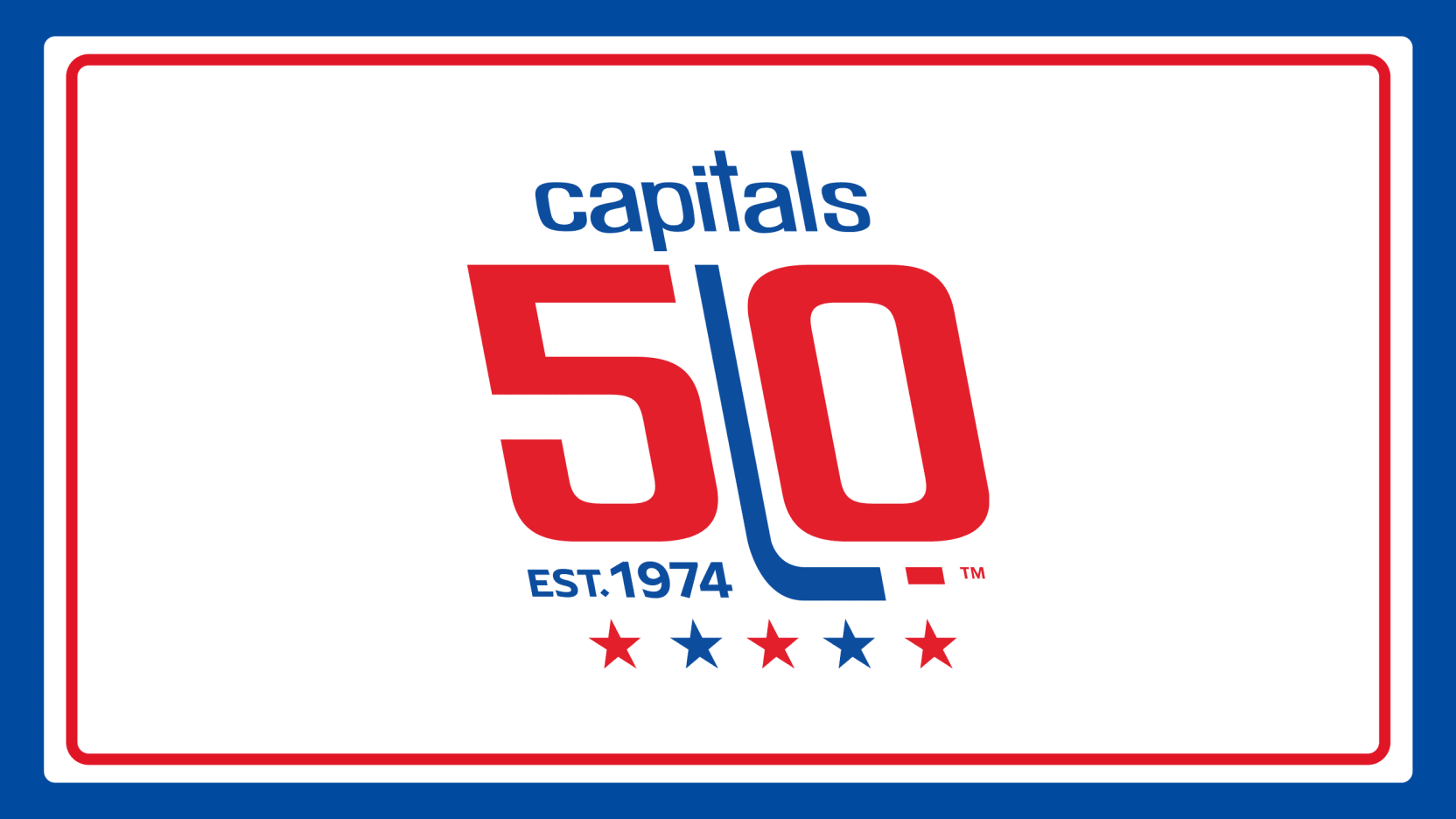
Taking a look at the Primary Logo first, we have a sleek, retro look that features the original lowercase Capitals font in it’s reverse-italic design that debuted back in 1974. The logo features the original Capitals wordmark up above the number 50 with the iconic Stick and Puck that has always been associated with the Capitals logos throughout their history. Underneath the “5” you see it say “Est. 1974” to recognize the year the team was established, and at the very bottom we see five stars alternating between red and blue. The stars represent how many decades the Capitals have been in the DMV. The colors for the primary logo use the original red and blue that were used back in 1974 to give it that true retro feel.
Overall, I like it. It’s a simple logo that does what it’s supposed to do and pay tribute to the past, and that’s all that really needed to be accomplished.

Jersey Patch
Moving onto the jersey patch, the Capitals are utilizing what they are calling the secondary logo for the 50th Anniversary. Same style font and look with the 50 and stick and puck, but this time it has a more 3D feel to it which allows for it to pop more when it’s on the jersey. Gone are the stars and the “Capitals”, but the “Est 1974” remains but in a cut ribbon fashion. Again, an overall solid look.
One other thing that I like about this is that the patch’s colors match that of the jersey it is on. So for the home and road jerseys, the patches will be in the current red and navy blue, so it blends really nicely with the jersey.
However, with that said, where it’s going to be placed on the home jersey is very disappointing. Due to the ill-advised ad patch for that sportsbook, the 50th Anniversary patch will not sit on the right breast like tradition usually has it at, but instead it will be placed on the left breast of the jersey where the C and A’s go for Alex Ovechkin and the rest of the leadership group. This will lead to clunkiness, and will not look appealing at all. I dread media day and seeing those player head shots with the patch on it with a C or A next to it.
I would expect that on the road white jerseys the 50th Anniversary patch would be on the right breast like normal.
Alternative Logos
Next up we have the alternate logos, and we’re also going to include the wordmarks here too. For the alternative logo the Capitals placed their primary 50th Anniversary logo in a circle border that is blue but with a white filling for the background. Now I know what you’re thinking, that’s not much of an alternate, and you’re right, but it’s what they are doing with the alternate that makes me excited.
So we know the primary logo is in the 1974 red, white, and blue, but as we have learned through both the info graphics, and in the promotional video introducing the 50th Anniversary logo, but there will be a “90’s Era” version and a “Modern Era” version. The primary is in what the Capitals are calling “Caps Classic”. The “90’s Era” is the one I’m personally more excited for as it features the Blue, Black, and Bronze colors. As of now we don’t know how often we’re going to get to see these colors, but I’m hoping that it’ll be just as frequent as the other versions. The third version is obviously the “Modern Era” with the current colors, and it looks fine.
Wordmarks
Looking at the wordmarks for the Capitals, they took a page from the secondary logo, and gave it a more 3D look to it which makes it standout really nicely. The three versions they have say “Capitals 50th”, “Capitals 50th Anniversary” with anniversary underneath Capitals 50th, and “Capitals 50th Anniversary” with all three in a straight line. For all three they utilize the secondary logo for the “50”. As of now we have only seen the wordmarks int eh 1974 colors, and will be interesting to see if they release them in the 90’s and Modern era versions.
TXHT may earn an Affiliate Commission if you purchase something through Cool Hockey and Dr. Squatch ads/links in this article.
Leave a Reply